How to
Make Kehilalinks Pages
Page Attributes and Block
Colors
Introduction
(Note: To do
this lesson, you must set one of the preferences in Composer. In a
Composer window, click Edit -> Preferences -> Composer, then
in the Editing section make sure that "Use CSS styles instead of
HTML elements and attributes" is checked. That will enable the
text highlight button on the editing toolbar and several other
features that are necessary for this lesson.)
The lessons up until now cover what I consider to be the basics of
making web pages. We can add text, images, and links to our pages
and make our pages available to other people. Now we will learn
techniques that give us more control over how our pages look.
Up until now, our pages have looked fairly plain, with only a few
images, horizontal lines, and colored text to brighten them
up. In this lesson we'll learn how to add background colors
and images to our pages and how to change the default colors of
links.
But this lesson is not only about aesthetics; we'll also learn how
to use page attributes that will help our pages be listed by search
engines like Google.
Page Colors
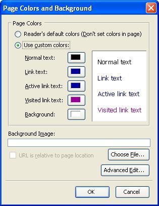
Open a new practice page in Composer. We'll set the page colors in
Composer by selecting
Format -> Page Colors and
Background
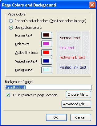
Composer will open a new window called "Page Colors and Background".
Near the top of the window are two check boxes. One says "Reader's
default colors"; the other says "Use custom colors". If you leave
"Reader's default colors" checked then your web page will always use
the default colors that are set in the browser of whoever looks at
your page. What fun is that?
Click the circle next to "Use custom colors:" to be able to select
colors. Beneath that check box are five color boxes that are
labeled, from top to bottom, "Normal text," "Link text," "Active
link text," "Visited link text," and "Background." The
"Background" color, intuitively enough, is the web page background
color. "Normal text" is all the text that you type in that
isn't a link or that you haven't specified a different color
for. "Link text" is all the text that is part of a link that
hasn't been visited yet (you "visit" a link by clicking on
it). "Active link text" is text that is part of a link that
someone has clicked on but hasn't yet released the mouse button, or
else the browser is having trouble locating the page to which the
link points. "Visited link text" is text that is part of a
link that has already been visited. The different colors for
links are intended to be visual indicators of which links have or
have not already been visited , so that someone who is looking at a
web page won't mistakenly follow the same link over and over again.
Each of the little color boxes is the color in the page for normal
text, links, and the page background color. In the example shown at
right, Normal text is black, links are blue, and links after you
have visited them turn purple. And the current background color of
the page is white. Your custom colors are probably something
different. Let's change that.
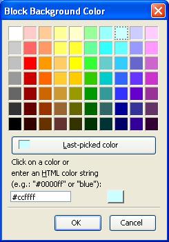 Click on the colored box to the right of
where it says "Background". This will open another box called "Block
Background Color". Click in the lightest of the blue boxes, the top
box third from the right. Then click "OK" to close the "Block
Background Color" window, and click "OK" to close the "Page Colors
and Background" window. The background color of your page should be
the same color as the background of this lesson page.
Click on the colored box to the right of
where it says "Background". This will open another box called "Block
Background Color". Click in the lightest of the blue boxes, the top
box third from the right. Then click "OK" to close the "Block
Background Color" window, and click "OK" to close the "Page Colors
and Background" window. The background color of your page should be
the same color as the background of this lesson page.
Try using different background and text color combinations in your
page. Well-chosen color combinations can make your page more
attractive and easier to read. Poor combinations can make your page
illegible. What happens, for example, if you use a black background
color and black text color? Exactly what you think will happen!
Note that browsers can be configured to ignore colors specified
in pages and to always use default colors, but the usual default
configuration -- in SeaMonkey and other browsers -- is to use the
colors specified in the web pages. If someone has configured their
browser to ignore what is specified in our web pages, however,
there's nothing we can do about it, so we won't worry about it.
Color Choices
In the "Block Background Color" window you could choose from any
of the 70 little color boxes to select a color, "or", as it says
at the bottom of that window "enter an HTML color string". HTML
defines 16
named
colors ("white", "black", "red", "maroon", etc.) and over 16
million possible colors that can be described using an "HTML color
string", which is a hexadecimal (base 16) number, such as #FFFFFF
(white), #000000 (black), #FF0000 (red), #00FF00 (lime), and
#0000FF (blue). Each digit can have any of 16 possible values,
ranging from 0 to F (0..9,A..F, where A..F represents 10..15). By
choosing different values for red, green, and blue (the first two
digits, the second two digits, and the third two digits,
respectively), you can make any of 16,777,216 colors. Wikipedia
has an excellent description of how this works, plus a chart that
shows many different colors and their HTML strings, so I'm not
going to attempt to duplicate that here. Instead, I'll direct you
to "https://en.wikipedia.org/wiki/Web_colors#Web-safe_colors"
if you want to know more. Even if you are happy with the 70 color
choices that Composer gives you, try different HTML color strings
to see how they work. Don't forget the "#" in front of the number,
which tells browsers that it's a hexadecimal number.
Block Colors
In lesson 2 I
mentioned "blocks", which are sections of text that are set apart
from other sections by having different paragraph formats (i.e.,
paragraph, Heading 1, Preformat, etc.) Using the Paragraph style,
Heading style, Address style, and Preformat Style all
automatically put the affected text in a block.
Other paragraph attributes, like centering, can also create
a block.
Blocks can have different
background colors than the page background color. You can click
in a block and use a tool on the Format Toolbar (the bottom of
the 3 toolbars I mentioned in lesson 2) to change the background
color for a block or the entire page. If you use a dark block
color, like this one, be sure to use a light color for the font.
For example, the "Block Colors" header above is a block, and each
of the other paragraphs after that up to this paragraph use the
"Paragraph" style (instead of "Body Text") or centering, so they
are in their own blocks and can have their own colors.
 Do you see the icon that looks like two
overlapping tiles, toward the left end of the Composer Format
toolbar? The top tile is the text color. You can use this as a
shortcut to changing the text color, instead of Format ->
Text Color. The bottom tile is the block background color.
Do you see the icon that looks like two
overlapping tiles, toward the left end of the Composer Format
toolbar? The top tile is the text color. You can use this as a
shortcut to changing the text color, instead of Format ->
Text Color. The bottom tile is the block background color.
When you mouse-over each of the tiles, a pop-up tells you that you
can "Choose color for text" or "Choose color for background", so you
can tell which is which. All you have to do to change the color of a
block is to click in the "Choose color for background" tile and
choose a color. That will change the color for whatever block the
blinking cursor is currently in.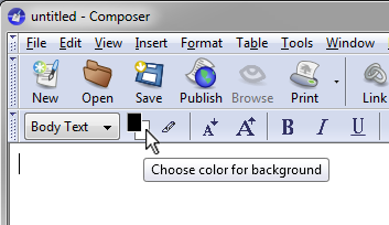
Note that, if the cursor is not in a separate block, changing the
background color will change the background color for the page. This
is because everything that isn't in its own block is considered to
be in one "page" block. This includes regular "body text" that is
not centered or in a separate paragraph or otherwise in its own
block. If you are trying to change the color for a block, but the
background color of the whole page changes, then you aren't in a
separate block.
Also note that all blocks automatically have a background color,
although if you haven't chosen a color then the color by default is
"transparent", which lets the page background color show through.
Make a block in Composer and try out block colors. An easy way to
test this feature is to insert a header (any header number), leave
the blinking cursor someplace in the header, then click on the
"Choose color for background" tile. You should see a color bar that
extends nearly all the way across the page and that includes the
header text.
Removing Block
Colors
Blocks are actually HTML "divisions" or paragraphs, marked by
specific types of HTML tags. When you insert text, change its
format, change its alignment, and so forth, Composer generates these
tags as it goes along, trying to find the most efficient way to
represent in HTML what it thinks you want our pages to look like.
Depending on the order in which you do things, Composer may leave
stray HTML tags, so that you may end up with blocks within blocks.
You won't notice these extra blocks until you add colors to them, of
course, so most of the time you won't notice anything out of the
ordinary. But if you do add colors to blocks, it can get very
frustrating to handle the stray blocks.
The simplest way to remove a block color is to first click someplace
in the block, so that the block background color is showing in the
little "Choose color for background" tile in the Format toolbar.
Then click on the "Choose color for background" tile and, in the
"Block Background Color" window that opens, delete the color string
(the color string starts with a "hash" sign and has six hexadecimal
digits, you may recall -- e.g., #6633ff -- so just delete that
string, leaving the box empty) and click "OK". That will remove the
background color (technically, it will reset the block's color back
to "transparent").
In an upcoming lesson we will learn another method of adding a
background color to a section of the page, so don't despair yet if
you can't use block colors to get an effect that you want.
Highlighted Text
Instead of using a background color on an entire block, you can just use a  highlight
color on selected text. The highlighting tool is on the format
tool bar, immediately to the left of the smaller font size
tool. It works on all text, including headers.
highlight
color on selected text. The highlighting tool is on the format
tool bar, immediately to the left of the smaller font size
tool. It works on all text, including headers.
You will have noticed by now that block
colors always extend to (nearly) the full width of the page, but
you can highlight selected words and phrases within a block to
get some nice effects.
To use highlight colors, select some text and then click on the
highlight tool icon. That will open the "Highlight Color" window,
where you will be given a choice of colors. Remember
to
change
the
font
color,
too, if you use a dark highlight color.
Background Images
Take a look at the Kehilalinks page for Skaudvile, in Lithuania:
http://kehilalinks.jewishgen.org/shkudvil/shkudvil.html
and look at that page's background. Do you see that the
background is a picture, not just a solid color? The picture seems
to cover the entire browser window, no matter how large you make the
window.
 That background is really a single small
image file (80 x 100 pixels). The browser automatically
"tiles" the background with the image so that the entire background
is covered, even though the image is small. You can do this
with any image.
That background is really a single small
image file (80 x 100 pixels). The browser automatically
"tiles" the background with the image so that the entire background
is covered, even though the image is small. You can do this
with any image.
Try using the Skaudvil background image in a page that you make in
Composer. To download someone else's background image (remember,
copyright laws always apply, so be careful to stay legal when you
copy background images), in the SeaMonkey browser (not in
Composer) right-click on the background and select "View Background
Image". Then you can right-click on the image to save it on your
computer (by right-clicking on the image and using "Save Image
As..."). For this example, please save the background image file in
the same folder as the Composer page that you are editing. (If you
right-click on a page in SeaMonkey and do not see the option to view
or save the background image -- or the option is grayed out -- it
probably means that the page has no background image.)
To use the background image in your page, in Composer again
select
Format -> Page Colors and
Background
and click where it says "Choose File...". Select the image
file and make sure the "URL is relative to page location" box is
checked. Then click "OK". After selecting the background image
file, click "OK" and you will see the image repeated over and over
as the background of the web page.
Try this with different images. As you will see, a bright, busy
picture doesn't make a very good background. The best
background images do not interfere with viewing the content of the
page.
A background image overrides the page background color, but not
block colors (try this out and see for yourself). If you have a
background image, however, and someone configures their browser to
not automatically download images, then the background color will
show. Because there may still be people on slow Internet
connections who don't automatically download images, even if you
use a background image it is a good idea to also specify a page
background color. Use a background color that is similar to the
overall color of the background image so that your text and
background colors will still work together even if the background
image is not there.
Tiling
As I mentioned before, the browser tiles the background with the
background image. This means that the browser first draws the
image in the upper left corner of the window, then puts another copy
of the image immediately to the right of the first image, then
another copy to the right of the second, and so on until the right
side of the window is reached. Then the browser starts over
again on the left side of the window, immediately beneath the first
row. Taking advantage of this feature, a web page can use a
very small image file to cover the entire window.
As an experiment with tiling, copy (i.e., right-click and save to
your work folder) this line image:

This is a very thin line, but use it as the background image in a
web page and what do you see? You should see that your page now
has a wide light-green stripe on the left side, with white to the
right of the green stripe. (If your monitor is calibrated
differently than mine, the line might look bluish to you rather
than green, but remember what I said about everyone seeing your
pages differently.) Because the browser repeats this image over
and over again, the small image (only 2K) seems to fill the entire
page, creating the illusion of a larger image.
"But", you may ask, "how do I get my text or images to line up
with the green stripe?" That's something that we will learn in
later lessons, so remember this background image trick for later.
Try browsing the page with this background image and make you
browser window very wide. If you have a large enough monitor and
can make the window wide enough, you will see the green stripe
again as the browser tiles the image horizontally. Many people now
have screens that will display 2560 pixels or more horizontally,
so if you want to use a thin, horizontal background image in your
web page and not have it tile horizontally, it would be a good
idea to make the image at least 2560 pixels wide.
Page Title, Author,
Description Properties
In addition to the page colors and background image, you can also
edit other page properties, such as choosing a title and description
for the page that will often appear in web search engines like
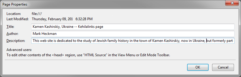
Google. Select
Format
-> Page Title and Properties...
The "Title" is the name of the page that appears in at the top of
browser windows when you view the page and that usually appears in
web search engines. It is a very good idea to choose a meaningful
title for your page. In this lesson, for example, you'll see the
title is "How to Make Kehilalinks Pages - Lesson..." For my Kamen
Kashirskiy page, I'll use something like "Kamen Kashirskiy, Ukraine
-- Kehilalinks page".
You can also put your name in as the author of the page. Why not
take the credit?
It is a very good idea to type a description. The description is
intended to be a sentence or short paragraph that describes the
page, beyond what the title says. For example, here is the
Description I will use in the Kehilalinks Kamen Kashirskiy page:
This web site is dedicated to the study of Jewish family history
in the town of Kamen Kashirskiy, now in Ukraine, but formerly part of the
Volhynia Gubernia of the Russian Empire.
Some search engines may display the full description, or just use it
as key words to classify your page; the use of all of these
properties for search engines is not standardized.
For example, this is the page title, author, and description I will
use for my Kamen Kashirskiy home page:
Increasing your
Rank in Search Engines
We want our Kehilalinks sites to be ranked at the top, or nearly the
top, of the search results when someone does a search on the name of
our kehilas. If our site is not near the top, people are likely to
miss it. Ranking in search engines like Google is determined by
"relevance". Each search engine uses its own, proprietary method of
calculating relevance, which is why search results are different
when you use different search engines with the same search terms.
Although the methods are proprietary, here are some ways that you
can improve your site's relevance in all search engines. I've
focused on Google here, although these techniques are applicable to
almost all search engines.
- Give your home page and all the other pages titles that are
accurate and specific. In the example shown above, for my Kamen
Kashirskiy site, I used "Kamen
Kashirskiy, Ukraine -- Kehilalinks page". Other
examples would be "Kamen
Kashirskiy Jewish Family History Web Site", or "Kehilalinks site for Kamen
Kashirskiy Family History".
- Use appropriate key words in the description for your home
page. In the example above, I used "This web site is dedicated to the
study of Jewish family history in the town of Kamen
Kashirskiy, now in Ukraine, but formerly part of the Volhynia
Gubernia of the Russian Empire." The name of the town,
the Gubernia it was in, the former country and the current
country, even the term "family history", all of these are key
words.
- Be sure to also use the kehila name frequently in the text
(this should be a given, but I'll mention it anyway). If the
name appears frequently then Google and other search engines
will be more likely to think, and quite logically so, that your
page is focused on that kehila. You should also include at least
once in the text all of the other possible name variations, just
in case people search on those names (Kehilalinks policy
requires this, anyway).
- Have lots of links from your site to other sites that have the
name of your kehila in their text. This is another way that
Google decides on the purpose of your site.
- Try to have lots of links to your site from other
sites that deal with your kehila. One of the ways Google decides
which site is more relevant is the number of links to that site
from related sites. (If everyone with an interest in your kehila
links to your site then your site must be the most relevant,
right?) For example, ask people who have family sites with
relatives who come from your kehila to add a link to your site.
Also ask the appropriate SIG to add a link from the SIG web
site. You can even add a link from the Wikipedia.com site for
your kehila, if one exists, to your site. Wikipedia is often the
#1 ranking site, and it is editable by anyone, for the most
part. I did that for my Horodenka
Kehilalinks site (https://secure.wikimedia.org/wikipedia/en/wiki/Gorodenka). Look at the bottom of the Wikipedia page, in the
"External Links" section, where it says "Horodenka
in the JewishGen
ShtetLinks project" (I made that link before Kehilalinks changed its name).
- Once your page is "live" and linked to from Kehilalinks and
other sites, search engines like Google will automatically find
and index it within a couple of weeks.
Assignment
Add a background color or image to your site. Be sure to change the
text and link colors to something that works well with your
background color. Try out lots of different color combinations to
see what you like best.
Also be sure to add good page titles and descriptions.
You can see what I did in my Kamen Kashirskiy page: kc-5.html. This is the same
site as last time, except for the colors and page properties. I used
a light blue background (#e9f2f7). For links I used JewishGen blue
and dark blue colors (#134b7d and #063358). I used a block color of
white for the Kamen Kashirskiy/Ukraine title and a block color of
what JewishGen calls "grey", although it looks tan to me (#e8e1d1),
for the "Compiled by" text. I could use a block color in those two
places because they are both centered, which puts them each in a
separate block. I also used a different Kehilalinks logo: this one
has a white background instead of the transparent background of the
one I used before (the relative URL of this one is "/images/shtetlogo.jpg").
Also notice the page title. There's a page description there, too,
that you can't see but that web search engines will find.
Copyright © 2009, 2010, 2012, 2013, 2014, 2016 Mark Heckman. All
rights reserved.